Australia

Learning Excel can feel like you’re standing at the base of a mountain, but getting started is much simpler than you think. At its heart, Excel is just a smart grid that organises information and does maths for you.
Think of it as digital graph paper with a powerful, built-in calculator ready to follow your every command.
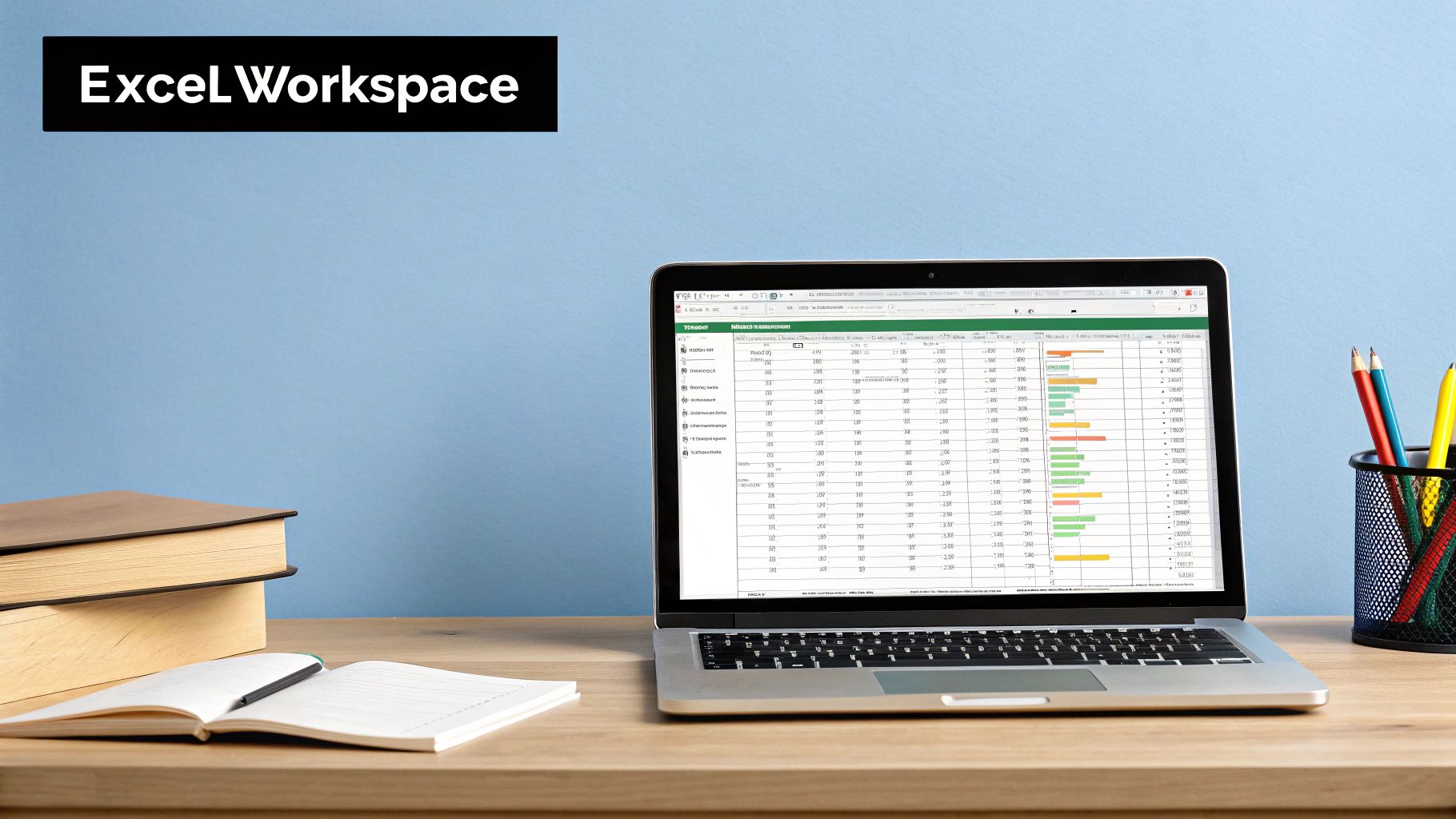
Your First Look at the Excel Workspace
Opening a blank Excel workbook for the first time can be a little intimidating. You’re greeted by a vast grid of empty boxes, menus, and icons. Don't worry, you only need to understand a few key areas to get going. Let’s break down the main screen into manageable parts, making it feel less like a complex cockpit and more like an organised workshop.
The goal here is to build familiarity. Once you can name the main components and understand what they do, you’ll feel much more confident navigating the interface. We’ll use simple analogies to make sure everything clicks.
The Core Components You Need to Know
Imagine the Excel window is a mechanic's garage. You have your main workspace (the car), your toolbox (the Ribbon), and a special workbench for detailed tasks (the Formula Bar). Each has a very specific job.
This is the basic layout that serves as your command centre for all data tasks.
This clean, grid-based interface is where all the action happens, from simple data entry to creating complex financial models.
To get you started, we’ll quickly break down the most essential parts of the Excel screen. Think of this as your quick-start map to the workspace.
| Component | What It Does | Analogy |
|---|---|---|
| The Ribbon | Holds all the primary tools and commands, organised in tabs like 'Home' and 'Insert'. | Your main toolbox, with different drawers for different jobs. |
| The Formula Bar | Shows the true content of a selected cell, especially useful for seeing formulas. | An inspector's magnifying glass, revealing what's really going on. |
| The Grid | The main work area, made up of columns, rows, and individual cells. | The engine bay of your car where you do all the actual work. |
Getting comfortable with these three areas is the first major step on your Excel journey. Let’s take a closer look at what each one does.
-
The Ribbon: This is the large toolbar running across the top of your screen. It contains all the main commands, neatly organised into tabs like 'Home', 'Insert', and 'Formulas'. It’s your go-to toolkit for everything from formatting text and creating charts to applying complex functions.
-
The Formula Bar: Located just below the Ribbon, this long white bar shows the actual content of any cell you’ve selected. This is critical because a cell might display a number (like "10"), but the Formula Bar reveals it’s actually the result of a calculation (like =5+5). It tells you the real story.
-
The Grid (Cells, Rows, and Columns): This is your main stage. The grid is made up of columns (lettered A, B, C…), rows (numbered 1, 2, 3…), and individual cells, which are the small rectangles where the rows and columns meet.
A cell is the fundamental building block of any spreadsheet. Every single piece of data you enter—whether it's a name, a date, or a number—lives inside a cell.
Each cell has a unique address, just like a house on a street, making it easy to point to. For instance, the cell in the top-left corner is called A1. This simple addressing system is the real key to unlocking Excel's power.
Understanding Cells, Rows, and Columns
Now that we're familiar with the main workspace, it's time to zoom in on the building blocks of every single spreadsheet. Everything you do in Excel happens inside its grid, which is just a simple, organised system of cells, rows, and columns. Getting your head around this is the most important step in our Excel for dummies guide.
Think of an Excel sheet like a massive library's filing system. The columns are the bookshelves, running vertically and labelled with letters (A, B, C…). The rows are the individual shelves on each bookcase, running horizontally and marked with numbers (1, 2, 3…). A cell is like a single book on a specific shelf—it’s simply the intersection where a column and a row meet.
Pinpointing Your Data with Cell Addresses
Just like every book in the library has a precise location, every cell in Excel has a unique address. This address is just the column letter followed by the row number. For example, the cell in the very top-left corner is A1 (Column A, Row 1). The one to its right is B1, and the one directly below it is A2.
This simple coordinate system is the secret to everything. When you tell Excel to do a calculation, you don't use the numbers themselves; you use their cell addresses. This is what lets your spreadsheet update automatically whenever the data in those cells changes.
This infographic breaks down the basic workflow, from finding a cell to putting your data into it.
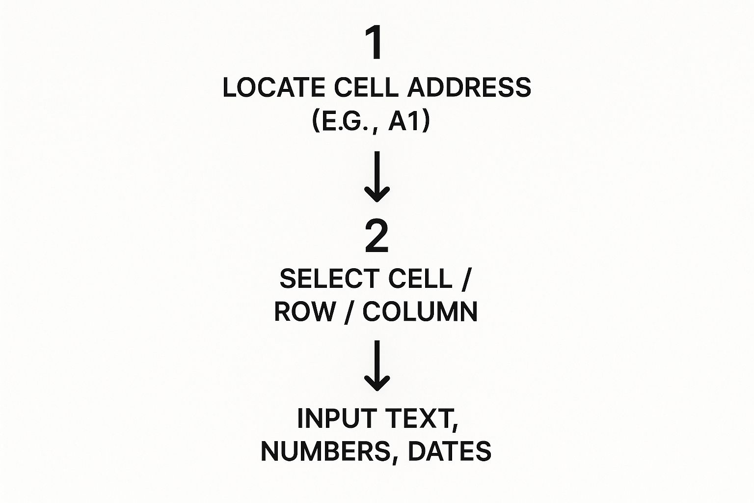
As you can see, identifying a cell's address is always the first step before you can select it and start typing.
Entering and Navigating Your Information
Getting data into a cell is easy. Just click on it to select it and start typing. You can enter a few different types of information, and Excel is usually smart enough to figure out what you mean.
- Text: Any mix of letters, symbols, or numbers that you want to be treated as a label (like "Monthly Sales" or "Invoice #123").
- Numbers: Any numeric value you plan to use in calculations (like 150 or -25.50).
- Dates: Formats like "15/10/2025" or "15-Oct-25" are automatically recognised as dates.
Once you have some data in there, you can move around the sheet pretty efficiently. Clicking with your mouse is fine, but using the arrow keys on your keyboard is often much quicker for hopping between adjacent cells.
Pro Tip: To select an entire column, just click its lettered heading at the very top of the grid. To grab a whole row, click its numbered heading on the left side.
This ability to quickly navigate and handle data is a huge reason for Excel's lasting popularity. In Australia, the demand for user-friendly office software with powerful data features keeps growing, especially with the need for cloud integration and access across multiple devices. Industry forecasts for 2025 show that Aussie users really prioritise software that makes sharing data seamless, which explains why tools like Excel are constantly evolving. You can dig into the data and explore more about these software trends for yourself.
Getting comfortable with this grid is your first practical skill. By understanding how A1, B2, and C3 act as unique markers, you've already grasped the core logic that powers every spreadsheet, from a simple shopping list to a complex corporate budget.
Unlocking the Magic of Basic Formulas
This is the moment Excel stops being a simple grid and starts acting like a powerful, automated calculator. So far, we’ve just been plugging in data by hand. Now, it’s time to let Excel do the heavy lifting for you using formulas—simple instructions that perform calculations on your behalf.
Forget any nightmares you might have about high school maths. We're starting with the absolute basics, the kind of simple arithmetic that can claw back a surprising amount of your time. You don't need to be a whiz; you just have to know how to ask Excel the right way.
This part of our guide is all about building your confidence. By the end, you’ll see how a few simple commands can wipe out hours of tedious manual sums, whether you're managing a budget or tracking project data.
The Golden Rule of Formulas
Every single formula in Excel, from adding two numbers to running a complex financial model, kicks off with one specific character.
The equals sign (
=) is the most important symbol in Excel. Typing it into a cell is like telling the program, "Get ready, we're about to do some maths!" If you forget it, Excel will just see your entry as plain old text.
Once you’ve typed =, you can start feeding Excel your instructions. This could be as straightforward as =2+2 (which will show the answer, 4), but the real power comes from using cell addresses instead of numbers.
For example, typing =A1+B1 tells Excel to find the numbers in cells A1 and B1, add them together, and display the result.
Your First Four Essential Formulas
Let’s start with four of the most common and useful formulas out there. Think of them as the foundational tools in your new spreadsheet toolkit. They handle adding up numbers, finding the middle ground, and spotting the highest or lowest values in a flash.
To use them, you’ll type the formula name, followed by a range of cells in parentheses, like (A1:A10). That colon (:) is shorthand for "everything from A1 through to A10."
- SUM: This adds everything up. The formula
=SUM(A1:A10)will calculate the total of all numbers in the first ten cells of column A. - AVERAGE: This calculates the average value.
=AVERAGE(B1:B5)will find the average of the numbers sitting in the first five cells of column B. - MAX: This finds the largest number in a range. Use
=MAX(C1:C20)to instantly spot the highest value in the first twenty cells of column C. - MIN: This finds the smallest number. In the same way,
=MIN(C1:C20)will find the lowest value in that same range.
These four functions alone can handle a huge number of everyday tasks.
Putting Formulas into Practice
Theory is one thing, but let's make this real. Imagine you’re creating a simple budget to track your weekly lunch expenses.
You’ve listed your spending in column B, from cell B2 down to cell B5:
| A | B |
|---|---|
| Day | Cost |
| Monday | $15 |
| Tuesday | $12 |
| Wednesday | $20 |
| Thursday | $18 |
Now, you want to calculate your total spending for the week.
- Click on an empty cell where you want the total to show up, like B6.
- Type
=SUM(B2:B5)and press Enter. - Instantly, cell B6 will display $65.
Excel has done the work for you. But here’s the best part: if you realise Tuesday’s lunch was actually $10 and change the value in cell B3, the total in B6 will automatically update to $63. That is the magic of formulas.
Organising Your Data with Simple Tables
As you start piling more and more information into your spreadsheets, just keeping things neat can feel like a losing battle. At some point, simply having data in rows and columns isn't enough to stay on top of it all. This is where Excel's Table feature becomes an absolute game-changer, especially for anyone just getting their head around Excel.
Think of a standard range of cells like a messy pile of business cards on your desk. Sure, the information is there, but it’s a disorganised jumble. Turning that range into an official Excel Table is like instantly scanning those cards into a perfectly structured, searchable digital address book. It transforms your static data into a smart, dynamic container that works for you.
The Power of Formatting as a Table
That 'Format as Table' button, sitting under the 'Home' tab, does a whole lot more than just splash some colour onto your cells. It fundamentally changes how Excel sees and interacts with your data. Once you convert a range into a table, you unlock a suite of powerful, built-in features that make managing information ridiculously easy.
This simple action is a cornerstone of good spreadsheet design and a key reason Excel is so dominant in the business world. Microsoft Excel is one of the most widely used tools for data analysis and document management in Australia. As of 2025, a notable 3,284 users in the country rely on it specifically for document management tasks, which shows you just how versatile it is beyond pure number-crunching. You can discover more insights about Excel's market presence.
When you create a table, a few things happen instantly:
- Automatic Headers: The first row of your data is locked in place as a header.
- Built-in Filtering: Drop-down arrows magically appear next to each column header.
- Easy Sorting: You can sort any column alphabetically or numerically with just two clicks.
- Dynamic Range: The table automatically expands to include any new rows or columns you add.
These features mean you spend way less time manually organising and more time actually getting answers from your data.
Sorting and Filtering in Action
Let’s make this real with a common example: a simple contact list. Imagine you have a spreadsheet with columns for First Name, Last Name, City, and Phone Number. As this list grows, trying to find specific people becomes a massive chore.
By converting this list into a table, you can bring order to the chaos in seconds. Need to find everyone named Smith? No problem. Want to see all your contacts who live in Melbourne? Easy.
A table gives your data structure. This structure is what allows you to ask questions of your data, like "Show me only the sales from last month," and get an instant, organised answer.
Let’s walk through the exact steps to make this happen.
A Practical Example with a Contact List
Imagine your contact list looks something like this, starting in cell A1:
| First Name | Last Name | City | Phone Number |
|---|---|---|---|
| John | Smith | Sydney | 0412 345 678 |
| Sarah | Jones | Melbourne | 0423 456 789 |
| David | Williams | Sydney | 0434 567 890 |
| Emma | Brown | Brisbane | 0445 678 901 |
Here is how you would turn this into a powerful, sortable, and filterable table:
- Select Your Data: Just click anywhere inside your data set (for example, cell B2).
- Format as Table: Go to the Home tab on the Ribbon, click Format as Table, and choose a style you like.
- Confirm the Range: A small pop-up will appear, confirming the range of your data. Since your list has headers, make sure the box for "My table has headers" is ticked. Click OK.
Boom. Your data will now be styled, and you’ll see those handy little drop-down arrows in each header cell.
Now, let's use these new powers.
- To Sort by Last Name: Click the arrow next to the "Last Name" header and select Sort A to Z. Your entire list will instantly reorder itself alphabetically by surname, keeping all the rows perfectly intact.
- To Filter by City: Click the arrow next to the "City" header. Un-tick the "(Select All)" box, then tick the box just for "Sydney." Click OK.
Just like that, your table hides all the other entries, showing you only the contacts who live in Sydney. This simple yet powerful feature is what makes Excel Tables an essential skill for any beginner.
Creating Your First Chart to Visualise Data
Numbers and tables are fantastic for storing and organising information, but let's be honest—a long list of figures can make your eyes glaze over. This is where charts and graphs come in. They turn your raw data into a visual story, making it instantly easier to spot trends, compare results, and understand the bigger picture.
Think of it this way: reading a list of your monthly expenses is informative, but seeing those expenses as slices of a pie chart immediately shows you where the biggest chunk of your money is going. Visualising data is a powerful way to communicate insights quickly and effectively, and Excel makes it incredibly simple to do.

Choosing the Right Chart for Your Story
Before you even click a button, you need to decide what story you want your data to tell. Excel offers a whole gallery of chart types, but for now, mastering three basic options will cover most of your needs. Each one is designed to present information in a different way.
- Bar Chart: Perfect for comparing different categories. Use this when you want to show which category is biggest or smallest, like comparing sales figures between different products.
- Line Chart: Ideal for showing a trend over time. This is your go-to for tracking progress, such as website traffic over a month or your savings balance over a year.
- Pie Chart: Best for showing parts of a whole. Use a pie chart when you want to illustrate proportions, like breaking down your household budget into categories such as rent, groceries, and transport.
Choosing the correct type is crucial for clarity. A line chart for budget categories wouldn't make much sense, just as a pie chart for monthly sales trends would be confusing.
Creating a Chart in Three Simple Steps
Right, let’s turn the abstract into action. We'll use the budget example from our formulas section to create a pie chart that visualises our spending categories. The process is surprisingly fast.
Imagine your budget data is set up like this:
| Expense Category | Amount |
|---|---|
| Rent | $1,200 |
| Groceries | $450 |
| Transport | $150 |
| Entertainment | $200 |
Here's how you turn this table into a compelling visual in under a minute. As you learn more, a comprehensive guide on how to graph in Excel can provide some extra valuable insights.
- Select Your Data: First, click and drag your mouse to highlight all the cells containing your data, including the headers (from "Expense Category" down to "$200").
- Insert the Chart: Next, go to the Insert tab on the Ribbon. In the 'Charts' section, click on the icon that looks like a pie chart and select the first 2-D Pie option.
- Customise Your Chart: Excel will instantly generate the chart and place it on your worksheet. You can now click on the chart title to rename it (e.g., "Monthly Expense Breakdown") and use the Chart Design tab that appears to change colours and styles.
That’s it! With just three clicks, you've transformed a boring table of numbers into a professional-looking chart that anyone can understand at a glance.
This simple process works for almost any chart type. By highlighting your data and choosing a different icon from the 'Insert' tab, you could just as easily create a bar chart to compare the amounts or a line chart if you were tracking expenses over several months.
Right, theory is one thing, but putting your new skills to the test is where you really start to learn and build confidence. It's time to combine everything we’ve covered—cells, formulas, tables, and charts—into a simple but genuinely practical project. We're going to build a basic monthly expense tracker from the ground up.
This hands-on exercise is designed to make those core concepts click. You’ll see exactly how they fit together to create something you can actually use. Following these steps is the best way to make your new Excel knowledge stick.
Step 1: Set Up Your Worksheet
First things first, open a new blank workbook in Excel. The initial step is to lay down some headers for our data. This gives our tracker a solid structure and makes it easy to read at a glance.
In cell A1, type "Date". Then, in cell B1, type "Expense Category", and in C1, pop in "Amount". Don’t worry about making it look pretty just yet; the goal here is to get the basic framework in place. This simple setup is the foundation of countless spreadsheets you'll encounter.
Step 2: Enter and Format Your Data
Now it's time to breathe some life into your tracker with sample expenses. Just enter a few rows of data underneath your new headers. Something like this:
| Date | Expense Category | Amount |
|---|---|---|
| 1/10/2025 | Groceries | $120.50 |
| 2/10/2025 | Transport | $45.00 |
| 3/10/2025 | Rent | $1500.00 |
| 4/10/2025 | Entertainment | $75.00 |
Once your data is in, click anywhere inside it and find the Format as Table button on the 'Home' tab. This one click is a game-changer. It instantly adds sorting and filtering tools, making your data much easier to manage as your list of expenses grows.
This project is a perfect example of why Excel is so highly praised for handling data. In Australia, user feedback from 2025 consistently highlights Excel's power to perform a huge range of calculations efficiently, boosting productivity for both personal and professional tasks.
Step 3: Calculate Your Total Expenses
With your data neatly organised as a table, it's time for a formula. We need to calculate the total of all your expenses. Click on an empty cell just below your 'Amount' column—C6 is a good spot.
In this cell, type the formula =SUM(C2:C5) and hit Enter. Like magic, Excel adds up all the values in that range and shows you the total. The real power here is that if you add a new expense to your table, this total will update automatically. No manual recalculations needed.
Step 4: Visualise Your Spending
Finally, let's create a chart to actually see where your money is going. Words and numbers are great, but a visual tells the story instantly. Highlight the 'Expense Category' and 'Amount' columns, making sure to include the headers.
Head over to the Insert tab and choose a Bar Chart. Excel will immediately generate a clean, visual breakdown of your spending, making it obvious which category costs you the most. You can even give your chart a title to make it crystal clear, like "Monthly Spending by Category".
This simple project ties together all the essential skills we've covered in our Excel for dummies guide. As you get more comfortable, you can apply this same knowledge to more ambitious tasks. For example, you could learn how to build a complete financial statement in Excel as a fantastic next step. You might also find our guide on crafting a professional business letter format useful for other professional documents.
Common Questions for Excel Beginners
Jumping into any new software is going to bring up a few questions. As you start your journey with Excel, it's completely normal to hit a couple of small roadblocks. This section is designed to tackle the most common queries that pop up for beginners, giving you quick fixes and clear advice to keep you moving forward.
Think of these as the answers to questions you haven't even thought to ask yet. Getting these fundamentals right from the start will help you build good habits and avoid frustration down the road.
Why Do I See ### in a Cell?
One of the first things that baffles nearly every new user is a cell suddenly filled with hash symbols (#######). Don't panic—your data hasn't vanished! This is just Excel’s polite way of telling you that the number in the cell is too wide to fit in the current column.
Luckily, it’s an easy fix:
- Widen the column: Hover your mouse over the right edge of the column header (e.g., the line between column B and C) until your cursor changes to a double-sided arrow.
- Double-click to autofit: The simplest solution is to just double-click this line. Excel will instantly and automatically resize the column to perfectly fit the widest thing in it.
What if My Formula Shows an Error?
Seeing an error like #VALUE! or #NAME? can feel discouraging, but these codes are actually helpful clues. They are Excel’s way of pointing you in the right direction to fix whatever has gone wrong with your formula.
Pro Tip: The
#NAME?error almost always means you've misspelled a function name. Typing=SUMMinstead of=SUMis a classic example. Always double-check your spelling first; it’s the most common culprit by a long shot.
The #VALUE! error, on the other hand, usually means you've tried to do maths with a cell that contains text. For instance, you can't add the number 10 to a cell containing the word "Apples".
How Can I Avoid Losing My Work?
There’s nothing worse than losing an hour of hard work because of a crash or power flicker. While Excel does have an AutoRecover feature, you can't rely on it alone. Building the habit of saving your work manually is absolutely essential.
Get into the rhythm of pressing Ctrl + S (or Cmd + S on a Mac) every few minutes. This simple keyboard shortcut quickly becomes second nature and is the single best way to protect your progress. Make it a reflex, and you'll never have to worry about losing important data again.
Ready to get your hands on the real deal? Digital Hub Key offers genuine, affordable software licences for Microsoft Office, Windows, and more. Get your instant digital key and start your Excel journey today by visiting https://digitalhubkey.com.


[…] you've got your data converted, cleaning it up is the next big hurdle. For anyone new to this, our Excel for Dummies guide is a great place to start learning the basics you'll […]
[…] Excel is your main workhorse, mastering its functions can seriously boost your productivity. Our Excel for Dummies guide at DigitalHubKey offers practical tips to get you started fast, ensuring you get the most […]